trip to the photographers' gallery
We went to The Photographers' Gallery to view an exhibition about food photography and to do a visual literacy workshop with photographer Marysa Dowling. We also took pictures on the way there and back and in the exhibition. The pictures were meant to be a way of exploring the idea of Edges. We used a photograph with one of more holes punched in it as a kind of viewfinder.


mirrior shots


we decided to take pictures on mirror and angle them in different positions and decided to see what kind of different and unique kind of pictures we would get.
I think that some of these pictures went well because of the camera's different angles and the way we were able to get some of the shots in unique positions and how we intereferd with some of the photos.
i think it would be better though if some of the glass wasn't fogy because you would get more of the picture and it would also be better if we only got the mirror so then you could see the photo more clearly.
There was a time when we thought it was just enough to photograph objects at eye level but then we began to move around, to climb mountains, to soar in airplanes and drop to the bottom of the sea. An we took our camera with us everywhere, recording whatever we saw.
-- Osip Brik, 1926
-- Osip Brik, 1926


The image on the right shows two nineteenth century photographers using their large format plate cameras. The image on the left shows a modern photographer from the first half of the twentieth century using a small, handheld Leica film rangefinder camera.
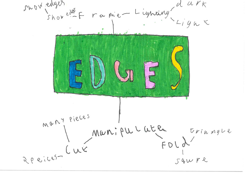
PAPER EDGES
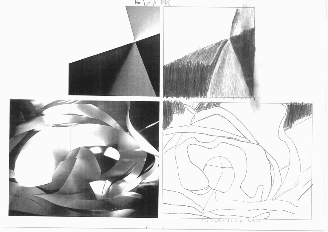
In class we tried to draw the photos on left to notice how the light can change something as ordanery as paper can have a very intresting photo. we also tried to see how the light changes in various ways in different areas of the sheet of the paper.
paper edges photo shoot


we took photos called paper edges shots that were based of a photographer called jerry read and we wanted to see the different types of lighting we could get with these pieces of paper.
I think these photos went well because it matches with different contrasts of light and how the paper looks with the light. we also folded the paper to see what would happen as well as get them on different angles.
i think it would be better if we could've only get the paper because it kind of seems messy and i wish we didn't get photos of direct light because it would be hard to see the picture.
|
|
|
concertina booklet
A concertina booklet is an origami-looking pop-up book. It is called a concertina booklet because the folded structure resembles a concertina, which is an instrument similar to an accordion.

cuted paper edges


All these photos are based from a photographer called Francis Bruguiere. we took a piece of paper and cut it but also it didnt split or make any holes and we put them up to different light sources and we also folded them in different shapes to see what different kind of photos we get.

In my personal opinion this photo is my faviourte because it gives off a ominus feeling and also like how its kinda blurry which in my opinion gives it effect
the only thing i dont like about it is how you cant see much of the cuts which wouldve made it better.
the only thing i dont like about it is how you cant see much of the cuts which wouldve made it better.
paper edges analysis


I think that they were taken in different areas of light and i think that they cut up the paper but not so they make holes.
In one picture i see curved lines and it has light coming out of it and in the other picture i see straight lines with darkness coming out of it.
I see black to be the main colour with strands of light coming out and in the other picture i see light being main colour with strands of darkness coming out.
one picture is moody,swirling and dark : i choose these words because it has circular dark moody lines that make it look swirly.
in the other picture i see simple,light and sharp edges : i choose these words because it has sharp-edges that are light which makes it look simple.
I prefer the light picture because its more simpler and it looks like something is coming out of the lines.
post-it note edges photoshoot


cuted picture edges


In class we cut pictures and put them on top of each other and see what kind of photos we would get.
I like the these pictures because it looks like the different pictures but the thing i dont like about it is that it lookes a bit meesy.
I like the these pictures because it looks like the different pictures but the thing i dont like about it is that it lookes a bit meesy.
moldrain piet photos


paper edges assessment


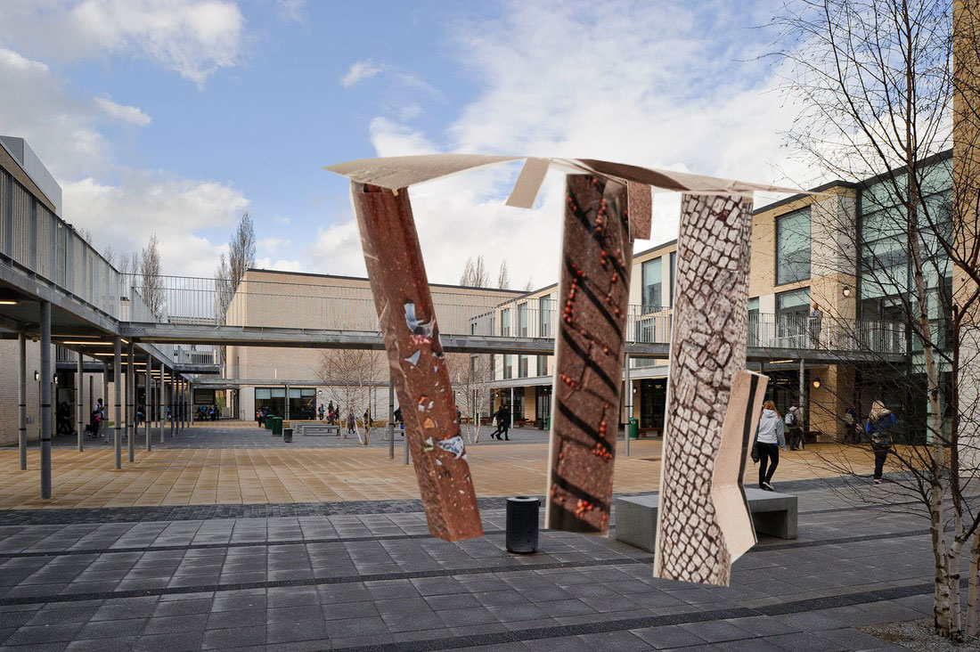
paper scupture photoshop pictures.
landscape photos and photoshop


edges comparision
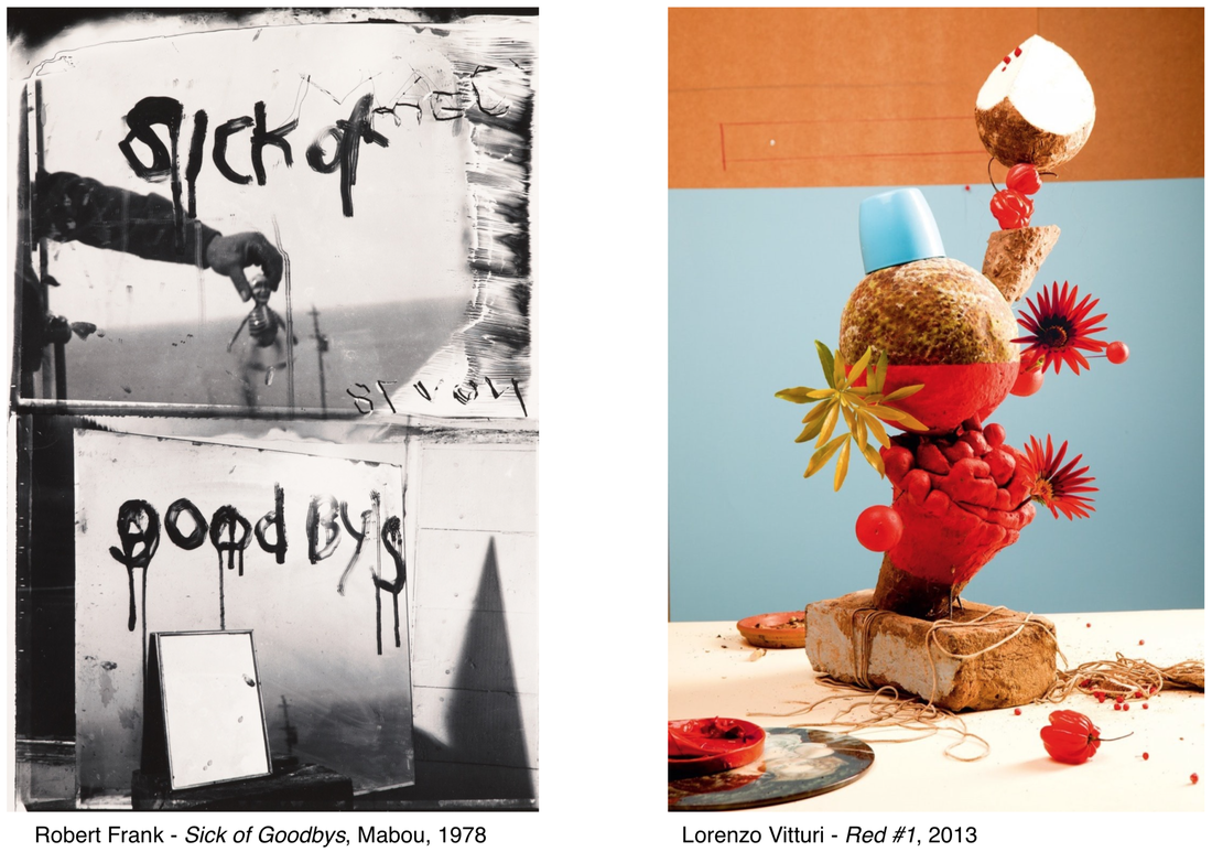
With the first picture i can see vandilized doors and metal in a black and white portait. I can see objects from the sea in the other picture and their stacked on top of each other in a light and colourful background.
The first picture is a portait witch is kind of emo-like. The second photo is also a potrait with a still life and joyful mood. What suprises me is how different the two pictures are in so many ways.
The main difference is that one of them has a very dark mood and the other has a lighter tone which is based on the sea but the darker one has may messed up things.
In the first photo it uses up all the space so you can see every single detail. with the second photo it uses the front of the picture and leaves the background behind so you can focous on the object in the middle.
For the first picture its a tiny door you can barley see, you dont't what it is because it is small. In the second photo it is the sculpter because its sea life stacked on each other and makes you think why.
In the first photo you can see white and black edges and its the edges where the photo is mostly disorted. In the second photo the edges arent to intresting only in the bottem because thats where most of the stuff is.
I think that it makes you think of every little detail in a photo graph and makes you think what gave them the idea.
For the first picture i would name it ''hell nah i saw nothing'' because if i saw that in real life i would leave immeditly. For the second photo i would name it ''beeeeeech'' because it reminds me of a beach.
If i was in the 1st picture i would be terrified cause its a place that looks like it would come out of a horror movie. if i were in the second photo i would feel relaxed cause i was on the beach.
I think that the reason Robert Frank made this photo is because recently lost someone and didnt say goodbye. I think the reason Tuet Corvro made this photo because he was inspired by the creativeness of the sea.
I think that the 1st picture is about death and not being able to say goodbye because it says sick of goodbyes and when it says that the man in the middle disserpers. I think the second picture is about creativity of the sea and how anything can be a picture depending on how you use it.
EDGES PROJECT
PHOTOGAPHY GALLERY
Come see pictures of edges by a Thomas Tallis student at Milbank way on the 23rd of febuary from 12am-6pm


i decided to do it on my stair way
today i decided to be creative with photoshop and try to create something myself and this is it.
