landscape photos


I would say this is my favourite photo and most successful because it is the most unique photo. I took it because it's still a landscape photo but from a very different angle that makes the world look bigger as well as smaller things like the grass looks bigger now.
landscape homework


'wrong' landscapes
For our assignment we were told to deliberately take 20 photos of landscapes that were 'bad' and here are the pictures I managed to make:


I'd personally say this is the best 'wrong' landscape mainly because of the fact that the picture isn't the right way up and that my thumb covers a sizeable portion of the screen.
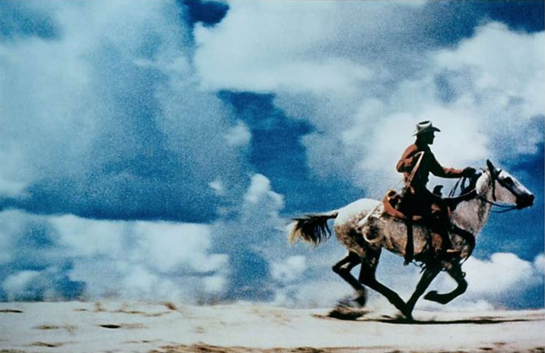
RICHARD PRINCE - UNTITLED (COWBOY), 1989
|
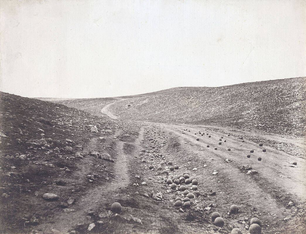
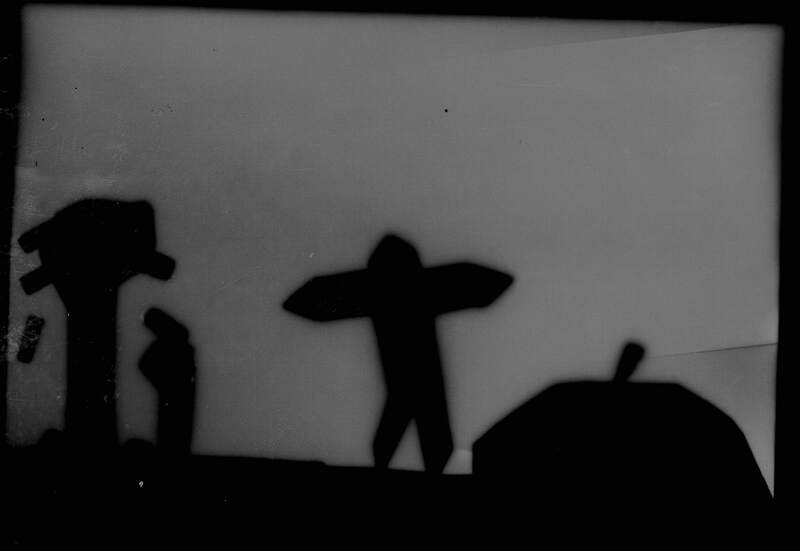
ROGER FENTON - VALLEY OF THE SHADOW OF DEATH, CRIMEA, 1855
|
For the Richard prince all I see on the photo is a cowboy seeming to wander in a direction endlessly on a high cliff which I find quite strange especially since he has his lasso out. The Shadow of Death picture is quite strange. There are a lot of cannon balls but no people. It's as if the cannonballs were placed there on purpose.
i would say that these photos have some similarities though like the fact that they both have quite a flat landscapes and the sky is one of the main points of the photo. These photos also have a few differences, for example in the Richard prince photo there is an actual main focus but in the valley of the shadow of death photo the whole photo itself can be seen as the main focus.
I would say that in the Richard prince photo the most important detail is the cowboy because it makes you wonder what is a cowboy doing in a place like a isolated cliff which is also an important detail the environment and the actual cowboy seems like they don't mix so it makes you ask why. For the shadow of the valley of death photo I would say the most important detail is the cannon balls on the ground because quite like the first photo it makes you wonder why but this i wonder why are the cannon balls there did they land there during a war or did someone purposely placed them there for some unknown reason.
The Richard prince photo makes me feel peaceful as there is really nothing too much going on it's just a cowboy riding on a cliff with a clear sky.
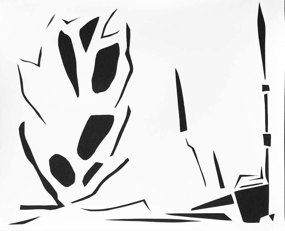
ray metzker - pictus interruptus
the original idea of the pictus interaptus came from a american man called ray metzker who was born in 1931 but sadly passed in 2014 but even so we can still continue to look at his work:
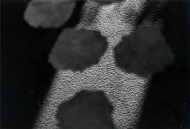


What really captures my attention about these pictures is that I don't understand what is actually in the pictures as there is nothing in these pictures that I can actually name or identify. From my view it looks like random shapes of black and white but then I realise these are pictures of mixed in things that make it look very abstract.
liz niesen/geraldo de barros comparison
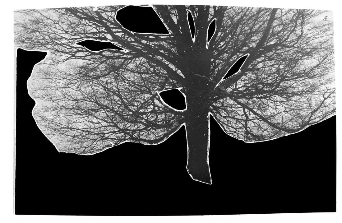
GERALDO DE BARROS - FROM THE SERIES SOBRAS, 1996
|
LIZ NIELSEN - GARDENING WITH YOU, 2020, PHOTOGRAM
|
In the Geraldo de Barros picture there is a tree surrounded by dark but it seems like the backgrounds missing and in the Liz Nielsen photo it's hard to say what I see because I'm not sure what anything is. I can see black and white shapes but maybe the rest of the picture is incomplete and could be missing. I find both pictures unusual because I don’t understand either of them or what they even are.
I don't really feel anything when looking at these pictures except confused but if I tried to re-make photos like these I would try and make them make sense so for the Geraldo de Barros picture I would add other details to the background or either add a whole new background.
I don't really feel anything when looking at these pictures except confused but if I tried to re-make photos like these I would try and make them make sense so for the Geraldo de Barros picture I would add other details to the background or either add a whole new background.
photogram landscapes
When we first made photograms we had to make the picture we were going to photogram which was this:
The first step of making a photogram was that we first had to go into the darkroom which was a room which was all red. We had to go into this room because the photograms won't work in normal light so we had to be in a room with all red lights. Then we had to put the picture we wanted to photogram on a light-sensitive photographic paper and the expose it to light in the dark room. Afterwards, we put the paper in a liquid called developer. We then stopped and fixed the paper before washing it.
This is a negative version of the picture above that was made in Photoshop and I realised how similar it looks to the photogrammed version of the picture which I thought was quite strange.
This was the result of my photo being photogrramed. As you can see the photo got reversed horizontally and in color and is a little distorted and a little blurry in some parts of the photo.
This is the negative version of the photogram but this time it looks more like a mix of the positive and negative photo which is not what I thought it would be like. I originally thought it would turn out too look like the positive photo of the picture.
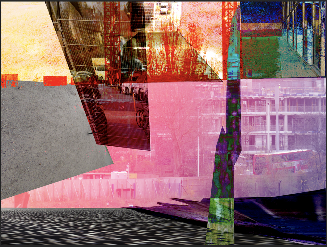
Photoshopped landscape montage
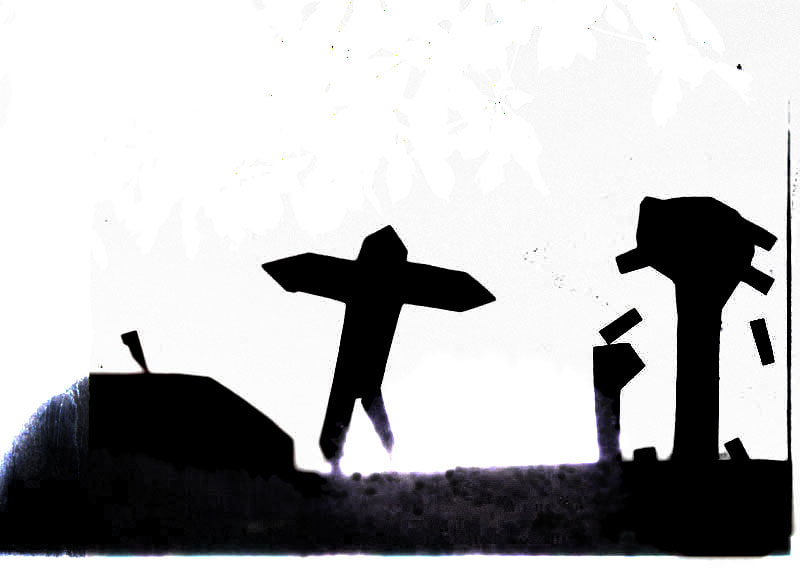
I created an image combining a picture from my 'wrong' landscapes and a photogram using Photoshop and what I exactly did was combined them then change the colours so that they look much different. As you can see the shape of the photogram is still there but the color is the changed color of a picture from wrong landscapes which was this:

It's strange to see how it looks nothing like this picture yet it is through the use of Photoshop.
google glitches
Today we had to research pictures on Google but not ordinary pictures, pictures of glitches that the Google algorithm makes and tries to fill in and these are the photos I took:


These Google glitches appear mainly because the way Google street view works is that they take pictures of all their surroundings but if they miss a few areas the Google street view algorithm tries to fill in the gaps and fix these pictures but obviously it doesn’t really work and it creates these pictures.
brea souders
Brea Souders is a visual artist working primarily in photography, Her images are a canvas for her creative practice that has extended from thoughtfully executed sculptural montages for her Counterforms series here is some of her work:


I found her work to be very unique and she was the inspiration to the pictures for the google glitches and her work is a lot more different then other artist works because she tries to use the google cameras and algorithm in the way google tries to fill in gaps it cant see with the camera and it create these glitches and as you can see in the photos she tries to mess around with her shadow to see what they would look like with google trying to fill in gaps it cant see and the end result creates distorted shadows which I believe was her intention.
Dafna talmor - constructed landscapes
Our work for our constructed landscapes originally came from a woman called Dafna Talmor who is an artist from London who has had her work in public collections such as the Deutsche bank and this is some of her work:


Her work is very interesting because it mixes two different or even similar pictures of landscape and makes them seem like one landscape. For example the top left picture captures my interest most because it looks like someone is taking a picture of a river at night time when in reality its two separate pictures just fused into one to create a picture that looks like a clean landscape photo.
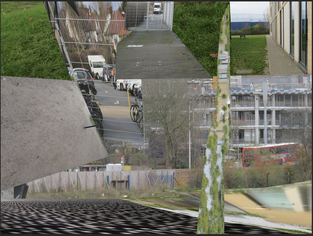
making day - contructed landscape picture
In my work today I am going to make a constructed landscape but instead of using only 2 I'll be using multiple and i will be making a landscape out of Photoshop using these photos and these are the pictures I am going to use to make the photo:


After using most of these photos and putting them into one picture to try to create a landscape photo using these landscapes this is the end result. As you can see I tried to make it sort of fit together by putting the green bits next to each other and what not and what I was trying to do was put photos of nature and photos of man made things together to see how would they look next to each other and now after this I'm going to try to see if I used more effects instead of pictures to see what the photo would look like.
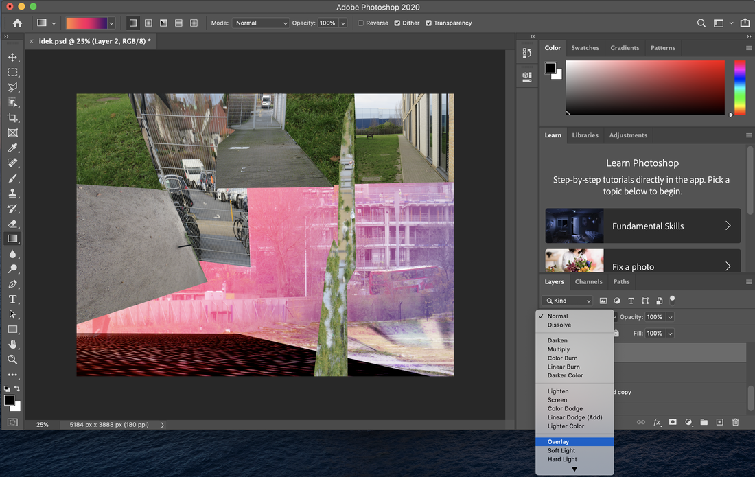
As you can see in this imagine I am just experimenting with the effects seeing what colours I can use and change to make the picture look more abstract without changing the picture.


These pictures are the end result of editing the colour. I used the colours blue, red and black and I changed the different effects you could use on each layer on Photoshop.
ANIMATED CONSTRUCTIONS
Screen Recording
SPLIT SCREEN VIDEO
SPLIT SCREEN VIDEO WITH PICTURE IN PICTURE and Soundtrack
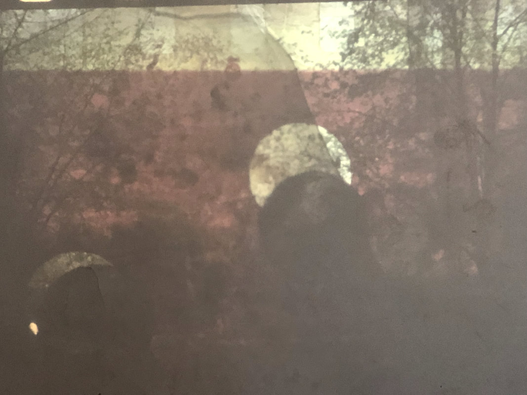
Adapted 35mm slides
|
|
I used old 35mm slides to make new images inspired by Dafna Talmor. The second image is more abstract and maybe have it so people wouldn't really be able to be able to tell what it is and out of the 2 photos I think this one was more successful.
the chemigran process
A chemigran is a piece of art where an image is made by painting with chemicals on light sensitive paper such as photographic paper and the chemigram is made without a camera, yet it is created in full light instead of in the darkness of the darkroom. In contrast to chemigrams, the first step in chemograms is to expose images in the darkroom and then process them with chemicals in daylight then Chemigrams can be made solely with photo paper, developer, and fixer, with results that will somewhat resemble watercolour. The possibilities can be multiplied by using materials from painting such as varnish, wax, or oil. the first chemigrams was first developed in its origins, beginning in the 30s of the 20th century, in the application of chemicals on black and white photo paper. This process of chemigram, also presented by Edmund Kesting in Dresden as "chemical painting" in the 1930s, served a cameraless art. here is a few photos of chemigrams:


penelope umbrico
In her work she uses photos she finds on Flickr and puts it a massive gallery like collage to make one big photo. She chooses photos that are similar to each other and I think every time she puts these photos together they all mean and symbolise something different.


Each single square of photo is its on photo taken by a single photographer and it makes me curious about how so many people had the same idea for a photo and how similar these photos look next to each other. I think it really says something about how the Internet has affected the way we take photos and why we take photos that we know people enjoy instead of taking photos that are new and original.
Here are a few examples of this:
Here are a few examples of this:


These are all from a gallery on instagram account called @instarepeat and they have taken pictures that were made in a singular pictures and has turned them all into galleries for us to see. Even though these are completely random people they all take similar photos and I think the point that Penelope Umbrico tries to make with her photos is that we're all trying to please with eye candy and that we're all unwilling to take more original photos.
PENELOPE UMBRICO inspired photos
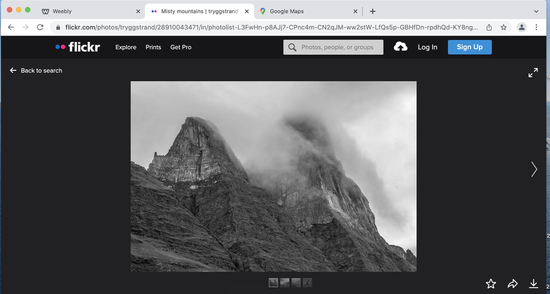
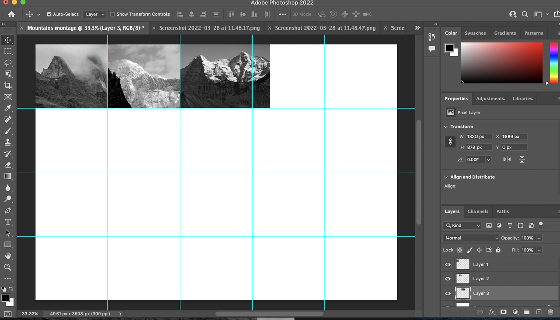
The first step to creating these photos was to get the pictures of a popular subject that people like to take photos of. I decided to go with mountains but in black and white. I did this because I believe that mountains are one of the most common photos that people take pictures of but for good reason as they are quite a sight. My main goal was to see the similarities and differences that these photos have. These are the photos I got:


Afterwards I had to put these photos in a grid in Photoshop to organise them. This would make it easier to make a collage. But there were some troubles fitting the pictures in the grids so I had to crop them and re-size them so they fit in the grids and the pictures started to overlap each other so I had to adjust the layers to stop this.
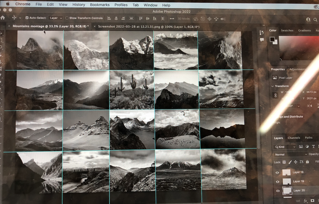
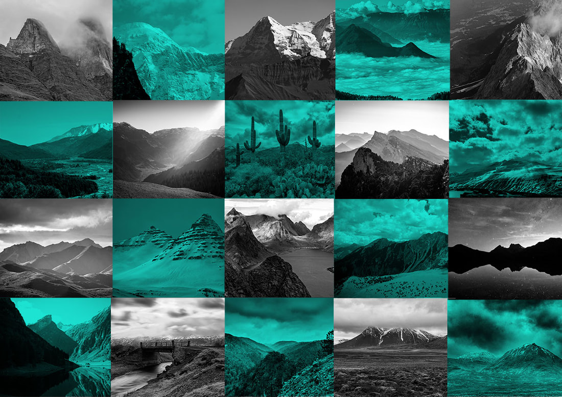
Afterwards I decided to put a blue layer over the picture but only half of the photos. This would make a tiled pattern. This was the final result:
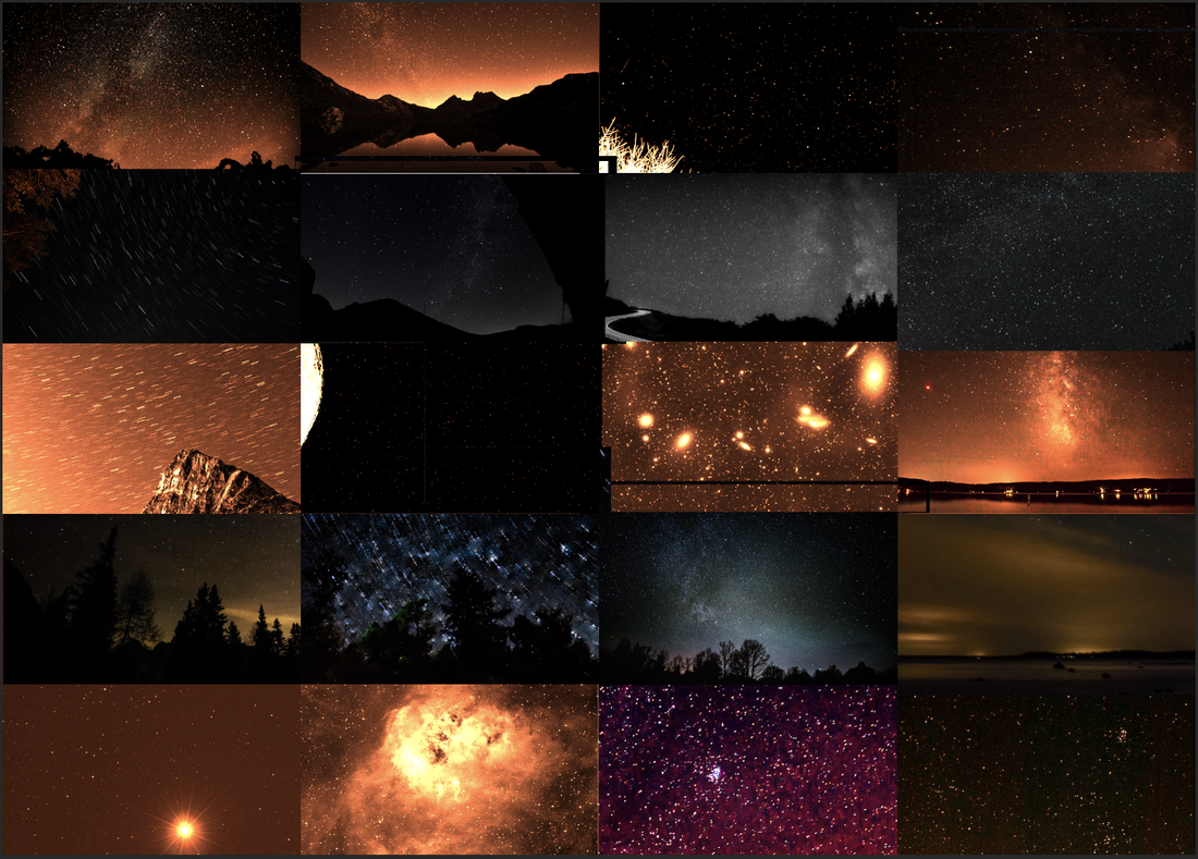
i decided to repeat the process with a different topic which was a starry night. I decided to use the colour orange instead and this is how it turned out:


Evaluation for constructed landscapes
I looked at the artist called Penolope Umbrico, and I was inspired by her work so I decided to base my work on her process because she took pictures from the Internet, websites such as Flickr and she put them into a grid to make it one larger image. I tried recreating the same thing on Photoshop. I decided to make my grid about mountains at first and the first step was to use Photoshop to make the guide, which would make the grid then I would put all the 20 pictures I took off the Internet into the grid then I had to re-size the photos to make sure they would actually fit and not overlap any other photos. I would have to crop the photos that did overlap wouldn’t overlap and then afterwards I coloured some of the photos so they made a tile pattern and to do this I had to make a new layer that was the colour blue. Any picture I wanted to be coloured I would just put them under the blue layer. And then afterwards when I completed the coloured pictures of mountains I made a new one with a new topic which was a starry night and I coloured it orange. Overall I leaned a lot of new skills such as, cropping, colouring photos and making grids.
When first making my project I wasn’t quite sure what to do and originally I wanted to make a cardboard exhibition of pictures but while in the process I decided to switch to something more to do with Photoshop and I wanted to base my work on landscapes and that's what I did but since I did two pictures I needed two themes so I did starry nights and mountains. While making this I learned about many other artists as well and have been introduced to their work. My main example is Penelope Umbrico and I feel like it really affected my work and influenced me in many ways
